This help article is for an old version of Direct Mail.
Messages that are designed using our modern template editor are composed of very simple building blocks: sections and blocks:
Sections
Sections contain blocks and come in five different varieties:
- One column
- Two column
- Three column
- Sidebar left
- Sidebar right
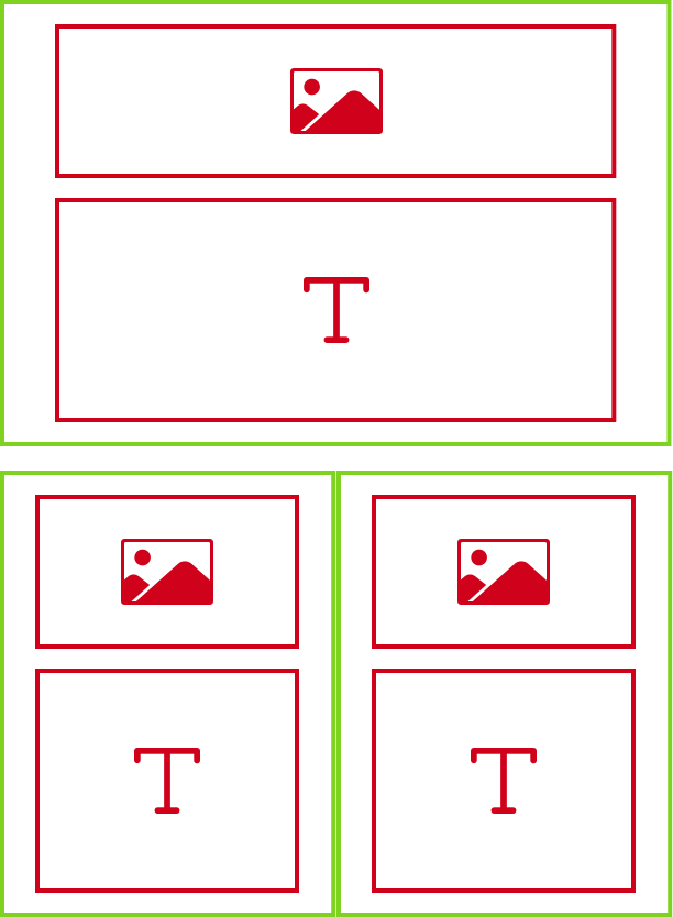
Each section has a set of properties that you can modify as you see fit. For more information about sections, see this help article. The diagram above represents a message with two sections: a one-column section on top and a two-section column on bottom. Most messages will include more than just two sections. For example, you may have a header section, a footer section, and a number of sections in between.
Blocks
Blocks are be placed inside of sections. In the diagram above, an number of image blocks and text blocks have been placed inside the two sections. There are eight different kinds of blocks you can place in your message:
- Text
- Image
- Video
- Map
- Button
- Spacer or horizontal line
- Follow—these are icons that give your recipients one-click access to your website, Facebook, Twitter, or other social media pages
- Share—these are icons that give your recipients a easy way to share your message on social media or via forward-to-a-friend
Each block has a number of properties that you can edit, including color, alignment, size, etc. Use the links above to learn more about each kind of block.
Colors & Fonts
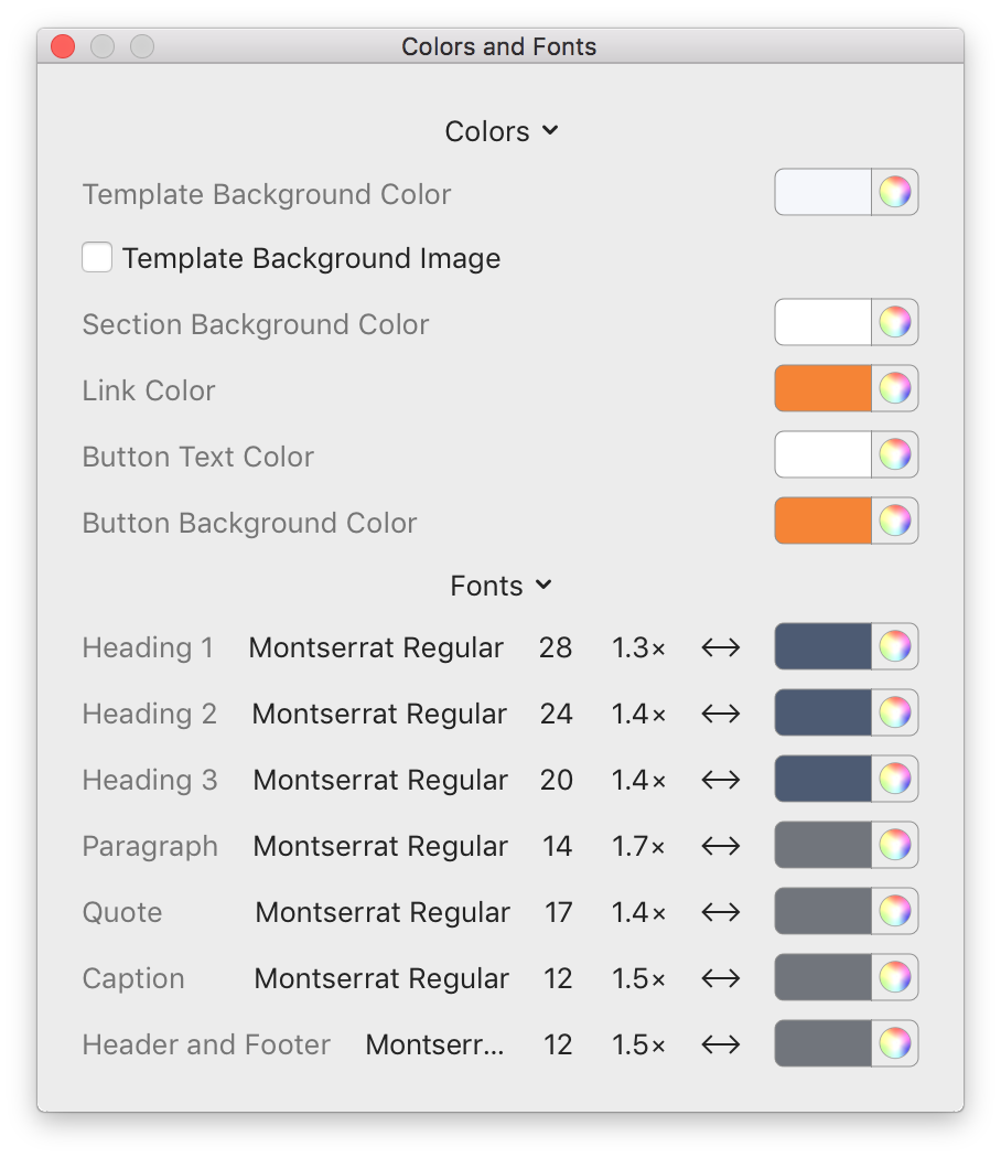
In addition to sections and blocks, each message has a number of settings related to default colors and fonts that apply to the entire message:
While you can customize fonts and colors on a block-by-block basis, we recommend taking a look at the Colors & Fonts panel first in order to keep your message visually consistent.